An interview with Judith Bookbinder, Vice President, Creative Communications, Hearst Magazines
A good presentation needs to be staged. Your audience needs to be comfortable with where they are. A good presenter sets up a premise, then discusses it and wraps it up. If you don’t, then the audience feels like they’re on a journey but they don’t know where they’re going.
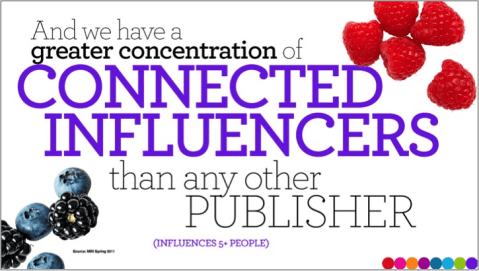
I have certain rules I always follow. Less is better. Never have more than three bullet points with no more than five words for each point (unless it’s someone’s title). Any more than that, you’ll find people are reading while you’re presenting. You’re making them not pay attention to you. A compelling presentation includes a mixture of visuals and bullet points.
If you aren’t an experienced speaker, a coach can help you improve the delivery, timing, and organization of your presentation so your remarks are in sync with your slides.
How can presenters use visuals effectively?
Too much wordiness is deadly. Don’t spend time reading Excel charts in your PowerPoint presentation. You’ll give your audience a headache.
A presentation is like being at a play or theater. The presentation needs to entertain as well as inform, and visuals do that. That’s why Infographics have been so popular. They graphically illustrate statistics that would be boring if they were just listed like a menu.
A presentation shouldn’t feel stagnant. The audience doesn’t want to feel like it’s in a classroom and you’re the college professor. Distinguish yourself by using captivating visuals and wearing attractive and colorful, but professional, attire.
Use flash, animation, video, photos and bright colors to create excitement.
Do you have favorite colors or fonts that you can recommend? What’s an ideal size for type?
I don’t like to play favorites, but certainly some colors and fonts aid in readability better than others. Stay away from yellow, light green and orange for lettering – they don’t project well. And any colors used should feel appropriate to your subject matter.
Of the universal fonts (common to Macs and PCs), I find Arial the most readable.
Using upper and lower case is easier on the eyes than ALL CAPS. But CAPS can be employed in headlines for emphasis. They help create a “hierarchy” of messaging –telling viewers what to look at first.
Should presenters encourage questions during the presentation?
Interactivity is a wonderful presentation tool. Get your audience involved during the presentation. Questions are so powerful that I’m not opposed to seeding questions in the audience. By that, I mean ask a friend or colleague to have a question ready to ask if no one speaks up.
You’ve probably noticed that it’s often difficult to get the first question, because people are shy about starting off the discussion. Once you receive a provocative question, though, the audience gets very involved, which is what you want.
Is it wise to use humor in a business presentation?
You can make important points with humor. Be playful and have fun. Fun is the word that comes up all the time in describing our presentations here at Hearst. Avoid death by boredom at all costs.
How about the length of the presentation?
Presenters make a big mistake in thinking that more information makes a presentation interesting. Instead, more information just bores people. Tell your audience in advance that more details will be available in the handout at the end of the presentation. They will be relieved they don’t have to take notes. Also, never simply take your handouts and turn them into slides. I’ve seen that happen at conferences and it’s a killer.
You want to keep your presentation to 20 minutes or under (and to 15-20 slides on average). Blame it on the Internet, but people want their information in shorter takes now.
The TED conferences present some of the most watched presentations anywhere. People pay lots of money to attend in person and the talks are viewed thousands of times online.
Yet TED limits speakers to 18 minutes, which forces them to focus on what they really want to say. TED also requires speakers to submit their talks and visuals for review and then rehearse in front of the TED staff, who offer their critiques. There is a lot of competition to get on the platform at these gatherings, so speakers practice long and hard.
As a speaker you need to hold your own and be as memorable as your graphics and videos. An experienced coach can offer feedback and tips that will help both you and your presentation stand out from the others.
Great speakers know that preparation and practice are the keys to success. They make speaking seem effortless because by the time they’re on the podium, they’re ready to wow their audience.

Judith Bookbinder is Vice President of Hearst Creative Communications, the full service, in-house agency she created in 1994. Her responsibilities include the branding/marketing of Hearst Magazines, Hearst Corporation and its numerous entities (from The Hearst Ranch to its world headquarters).
Since the department’s inception, Judith has helped market the launches of Marie Claire, O, The Oprah Magazine, Food Network Magazine and HGTV Magazine. In 2012, she helped create a commemorative book, documentary and marketing campaign in honor of Hearst Corporation’s 125th Anniversary.
Prior to joining Hearst, Judith ran her own design firm for 11 years – Judith Bookbinder Designs – that specialized in magazine promotion, counting Hearst Magazines among its clients.


One Comment
I think you can pretty much get away with any color scheme and font size – as long as it’s consistent. That’s where a lot of people mess up as far as professional Powerpoint presentations go. A simple design and simple templates along with charts/animation/graphics makes things a lot more interesting.
You shared several helpful tips here. Thanks for posting!